
Typography is more than “picking a font.” It’s how your brand sounds and feels in written form, shaping clarity, emotion, trust, and recognition at every touchpoint. If you’re wondering why is typography important in branding, the short answer is: typography makes your brand readable, memorable, and consistent you across web, app, social, packaging, and print.
Typography matters in branding because it communicates your brand’s personality, improves readability and accessibility, and boosts user trust and performance across channels. A strong typography system makes your brand recognizable and usable. It aligns tone with audience expectations, meets accessibility (contrast/spacing) guidelines, and supports performance and SEO by using modern font tech and good loading practices, leading to clearer communication and higher user satisfaction.
Typography in branding is the structured selection and use of typefaces, sizes, spacing, weights, and hierarchy to express a brand’s voice consistently. A complete brand typography system includes rules for headlines, body copy, UI text, captions, links, and emphasis, plus guidance for color contrast and responsive scaling so text remains readable and accessible on every device.
Pro tip: Treat typography as a product decision, not decoration. Use research and A/B testing to validate choices with your real audience, especially legibility across ages and devices. Recent readability research shows preferences differ by age and font characteristics (e.g., weight/grade), so test with your target segments.
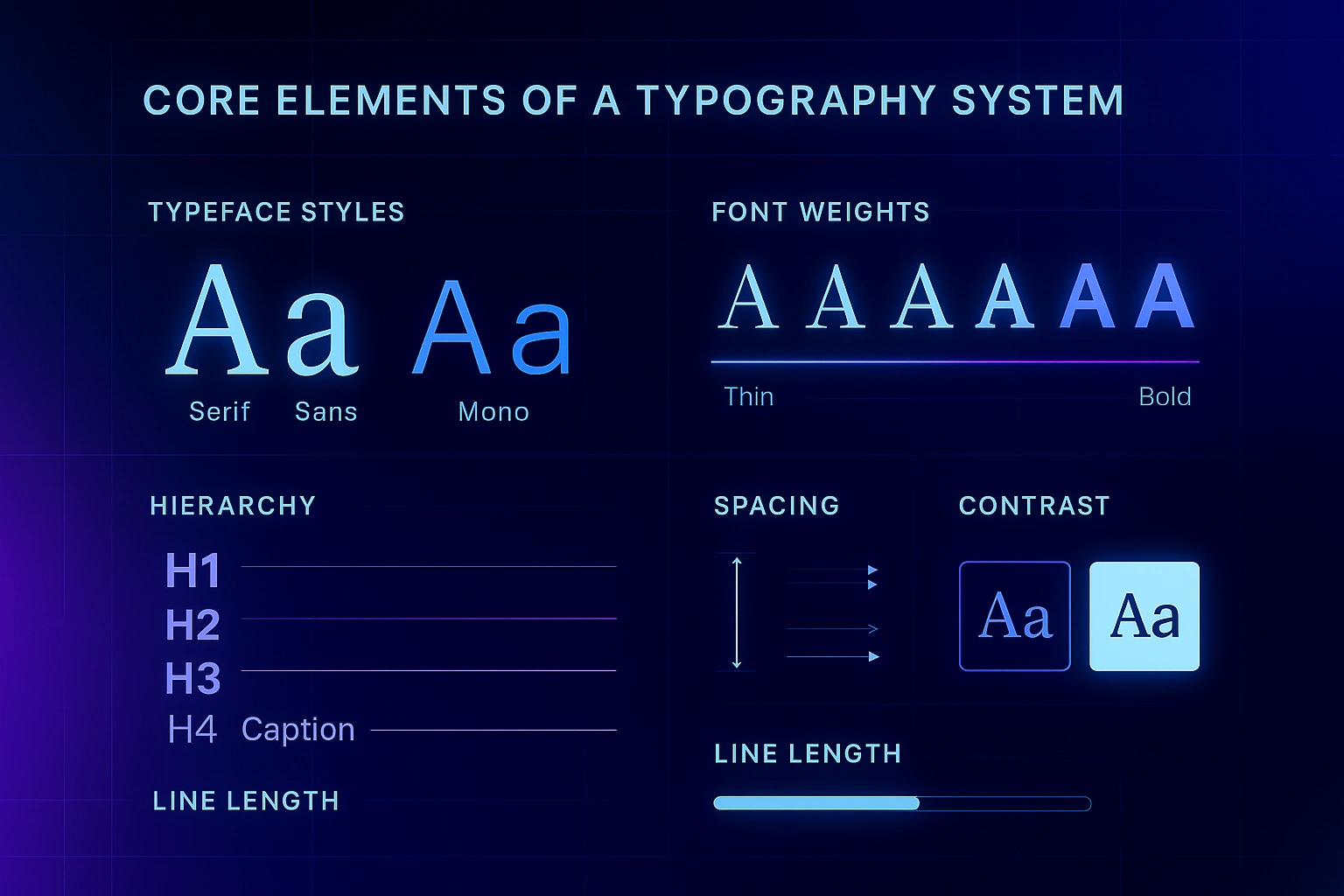
Choose a primary type family that aligns with your positioning (e.g., a humanist sans for approachable tech, a modern serif for editorial or premium). Ensure it offers enough styles (italic, bold, extended language support) for future-proofing and consistent usage.
Don’t rely only on bold/regular. Grades can fine-tune darkness without reflow, and optical sizes improve legibility at very small or very large settings. Variable fonts expose these adjustments along a single file’s axes for more precise control and fewer files to maintain.
Define a repeatable scale for headings, subheads, body, captions, and overlines. Limit the number of sizes to simplify scanning and make pages feel organized. Public-sector design systems (USWDS, GOV.UK) model consistent, tested scales for high readability.
Comfortable spacing prevents reader fatigue. WCAG 2.2 requires that content remain usable if users increase line height, letter, and word spacing, plan for this in your CSS and component library.
Keep line length within an easy-to-scan range. Many design systems recommend roughly 50-90 characters per line for body text to reduce eye strain and backtracking.
Use sufficient contrast for text and UI components. WCAG AA calls for at least 4.5:1 for normal text and 3:1 for large text; note that logotypes are exempt, but marketing copy and UI text are not.
Plan for diacritics, non‑Latin scripts, and fallback stacks. Choose licenses suitable for web, app, print, and broadcast so your team can stay compliant as the brand scales. Adobe, Google Fonts Knowledge, and foundries publish coverage notes, verify before launch.
Pro tip: A single variable font can replace several static files (e.g., Light, Regular, Bold) and allow fine‑tuned weight/width adjustments at runtime, often improving design flexibility while reducing requests. Use WOFF2 only, subset to needed ranges, and monitor LCP/INP.
Type choices evoke feelings and shape brand perception in subtle ways, from trust to memorability. Industry research presented by Adobe and Monotype has reported measurable uplifts in positive response, memorability, and trust when the “right” font aligns with brand personality and context; use such findings as a cue to test what resonates with your audience rather than as universal truths.
Typography affects user experience and Core Web Vitals through file size, loading, and layout stability-factors that can influence search visibility. In March 2024, Google promoted Interaction to Next Paint (INP) to a stable Core Web Vital, emphasizing responsive interactions; poorly loading fonts can harm perceived responsiveness. Serve modern formats (WOFF2), subset to needed characters, and use sensible font-display to avoid invisible text or layout shifts (CLS).
In plain terms: fast, legible text helps people read, engage, and trust your content-outcomes at the heart of modern search quality. Combine great type with helpful content and accessible design for the best results.
Typography gives your brand a consistent voice in text. It translates positioning into visual tone and ensures communications remain readable and accessible across channels through rules for hierarchy, spacing, and contrast.
How does typography affect brand perception?
Type choices cue emotions (e.g., refined vs. friendly) and can measurably influence perceived trust and memorability when aligned to audience and context-another reason to test with real users.
Most brands succeed with one primary family (plus a mono for code/technical contexts if needed). Use weights, grades, and sizes to create variety before adding more families-this keeps pages cohesive and easier to scan.
Neither is inherently “better.” Readability and fit depend on the design, size, context, and audience. Research shows preferences may vary by age and font characteristics-validate with your users.
Aim for generous line height (around 1.4-1.6 in body copy) and ~50-90 characters per line to reduce fatigue and backtracking. Your design system should enforce these defaults.
Variable fonts pack multiple styles into one file with adjustable axes (weight, width, optical size). They offer design flexibility and can reduce requests when implemented well.
Indirectly, yes. Fonts influence experience metrics (e.g., INP, CLS, LCP) and readability, which affect engagement and discoverability. Optimized loading and accessible type support better outcomes.
WCAG AA requires at least 4.5:1 for normal text and 3:1 for large text. Logotypes are exempt; UI and marketing copy are not.
Follow design-system guidance and test with your users. As a reference point, GOV.UK uses 19px for standard body on large screens, tuned for readability at scale.
Codify a type scale, contrast rules, spacing, link styles, and do/don’t examples in your brand system and design tokens (e.g., USWDS guidance), and make it easy to find in your repo or brand site.
Typography is your brand’s visible voice. When you understand why typography is important in branding, from personality and trust to accessibility and performance, you can design a system that’s beautiful, inclusive, and fast. Start with audience‑fit, meet WCAG 2.2, optimize loading, and document rules so every touchpoint sounds unmistakably like you.
For deeper reading, see:
From branding to digital solutions, let’s take your business to the next level together.